
Multivariate methods
In this workshop will explore three methods for visualizing and interpreting multivariate data: principal components analysis, discriminant function analysis (optional), and simple correspondence analysis.Pitcher plant shape
Darlingtonia californica is a partly carnivorous pitcher plant that grows in fens and along seeps and streams in the mountains of Oregon and California. Its pitchers are tubular leaves with a round hood and a mouth at the base of the hood (see figure below). A "fishtail" appendage hangs from the mouth. Wasps and other prey are attracted to nectar secreted by extrafloral nectaries along the hood, mouth, and fishtail. Plants absorb nutrients excreted by a food web of bacteria, protozoa, mites, and fly larvae that break down the prey. We will use principal component analysis to investigate variation among individual plants in their dimensions.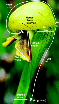 photo
from
Ellison & Farnsworth (2005)
photo
from
Ellison & Farnsworth (2005)Measurements of 87 plants from four sites were made by Ellison and Farnsworth (2005, The cost of carnivory for Darlingtonia californica (Sarraceniaceae): evidence from relationships among leaf traits. Am. J. Botany 92: 1085-1093). Their measurements are here. I obtained them from the web page of A. M. Ellison for the book by Gotelli and Ellison (2004, A primer of ecological statistics. Sinauer, Sunderland, Mass.). To simplify, I have removed three outliers. Most plant traits in the file are illustrated in the image above, and trait labels are fairly self-explanatory. Keel width measures the span of the pitcher tube. "Wing" traits probably refer to the fishtail appendage.
- Read the data and transform as necessary to put them on an equivalent scale. See the multivariate Rtips web page regarding how best to analyze linear, area and mass or volume measurements in the same analysis.
- Examine associations among variables using graphs. Which variables are most strongly correlated with one another? Positively or negatively?
- Carry out a principal components analysis on the pitcher plant measurements.
- Examine the proportion of variance explained by each principal component. What proportion of the variance is accounted for by the first principal component? By the first two? How many components are needed to capture 95% of the total variance among plants?
- Create a scree plot to visualize the magnitudes of the eigenvalues.
- Create a biplot to visualize the contribution of traits to the first two principal components.
- Examine and interpret the eigenvectors for the first two principal components. Which variables contribute the most to the first two principal components? Do the loadings for these variables have the same sign or opposite sign? On this basis, state how these pitcher plants vary principally from one another?
- Examine the eigenvectors for the third, fourth and fifth principal components. Do they have a straightforward interpretation too?
- Save the scores for the first four principal components.
- Create a plot of the first two principal components. Set the values of xlim and ylim to be the same for both axes so that they have the same range. This will reinforce the impression that the two axes have unequal variance.
- Next, create a plot of the third and fourth principal components. Set the values of xlim and ylim to be the same as in the previous command (10) so that the axes have the same range. This should create a visual impression that the differences between the data points captured by the higher principal components are smaller in absolute magnitude than those captured by the first two components.
- Replot the first two principal components, but this time use different symbols for the different sites where the plants were measured. Does any of the variation among plants reflect differences between sites? Examine the third and fourth component as well.
Pitcher plant discrimination
(Optional, if time permits -- carry out the rodent ordination exercise first)Principal components analysis finds axes of variation but pays no attention to the groups in which meassurements might belong. In contrast, discriminant analysis finds axes that maximize separation among groups, relative to variation within groups.
- Carry out a discriminant function analysis to find trait combinations that best discriminate plants from different sites.
- Plot the first two discriminant functions, using different symbols for plants from different sites. How much separation between groups is evident?
- Reclassify the pitcher plants used in the
calculation of the discriminant functions to sites. Compare the
classification with the true site of origin of the plants in a table.
How successful was the classification?
(Note that the misclassification is expected to be unrealistically low when carried out on the same individuals used to calculate the discriminant function. Typically, half the data would be used to generate the discriminant function, and classification success would be evaluated using the other half).
Rodent ordination
Correspondence analysis is used to ordinate species assemblages based on species composition and similarity in species abundances. The data for this exercise are rodent species abundance from 28 sites in California (Bolger et al. 1997, Response of rodents to habitat fragmentation in coastal Southern California, Ecological Applications 7: 552–563). The file in contingency table format is located here. I modified the data table downloaded from the web site of Quinn and Keough (2002, Experimental Design and Data Analysis for Biologists, Cambridge Univ. Press, Cambridge, UK).The 9 species are indicated by variable (column) names. Genus abbreviations are: Rt (Rattus), Rs (Reithrodontomys), Mus (Mus), Pm (Peromyscus), Pg (Perognathus), N (Neotoma) and M (Microtus). Rattus and Mus are invasive species, whereas the others are native.
- Download the file and read into a data frame in R. Inspect the table to get a sense of which species are abundant and which are rare, which are widely distributed and which occur infrequently.
- Carry out a correspondence analysis using these data. Extract two axes from the species abundance data at sites. How strongly are the site and species data correlated along the two axes?
- Plot the results from (2). Overlap of points may make it difficult to identify some plots and species (unfortunately there's no built-in "jitter" option for this plot). You can use the species scores to help identify them.
- Use the plot in (3) and the species scores to interpret the results of your analysis. How are each of the species contributing to the correspondence axes? Do you notice any differences between the invasive and native species in their distributions?
- As you probably surmised, the results of the first round of analysis were chiefly driven by the introduced species. To examine the native species as well, create a new data frame with Rattus and Mus deleted. This will generate some sites with no species present. Delete these sites from the new data frame.
- Carry out a correspondence analysis on the native species. Extract two axes from the species abundance data at sites. How strongly are the species and site data correlated?
- Plot the results from your analysis in (6). Is the plot useful in helping you to identify which species tend to co-occur? And which species tend not to occur together? Confirm this by looking at the original data. Are your interpretations correct?
- Based on the plot in (7), which sites tend to have similar species composition? Which have different species assemblages? Confirm this by looking at the original data.
- Based on the same plot, can you match the species to specific sites? Confirm this by looking at the original data.